Popular Post
Showing posts with label Information Graphics. Show all posts

Plume and Doom


With the hypothesizing, calculating, and scenario analyzing, regarding the radioactive emissions from Japan’s Fukushima nuclear power plant, I was reminded of a very unusual infographic that ran 65 years ago in Fortune.

In 1946, precisionist painter Ralston Crawford, was dispatched by the magazine to witness the nuclear testing at Bikini Atoll. Among the 124 members of the press to attend, Crawford was the only artist. His observations and reactions resulted in a six-page piece that included photographs, paintings and an infographic.

Although known as a painter, Crawford was an experienced information designer. During WWII, he served in the Army Air Corps Visual Presentation Unit as chief of its Weather Division. There he created maps for Army pilots, and developed a pictorial language of weather symbols to translate meteorological data used in military operations into a more comprehensible format.

The last spread of the Bikini article is about the migration of radioactivity. This is the one Crawford felt was essential, since what it showed was precisely what was not directly observable at Bikini. On the left side of the spread is a photo of the explosion’s cloud column. It is annotated to show how the mass of radioactivity was dispersed by prevailing winds at three altitudes. On the facing page there is a map showing where the plume would have traveled had the atomic bomb been detonated over New York City on that same day. You can see its shape and direction based on wind conditions in the northeast that day compared to the inset map showing how it actually traveled at Bikini.

Below are small versions or the spreads as they appeared, but see and read the whole piece at Full Table.


Sources: Fortune; Ralston Crawford, Barbara Haskell (Whitney Museum catalog)

Du Bois Charts: Twittered, Tumbld, Stumbled, fffound

African American women on the steps of a building at Atlanta University, 1899 or 1900. Photo by Thomas E. Askew (Du Bois archive, Library of Congress)

Two weeks ago ( I know, that's a bout a decade in internet time), I posted the awesome charts that W. E. B. Du Bois and his students at Atlanta University produced for the Paris Exposition in 1900. I still haven’t quite processed the overwhelming response to this work. Not only has the massive amount of tweeting and reblogging, sent my page views through the roof, but the charts have gotten attention way beyond the infographic and design communities. They have been posted on political blogs and have sparked some lively debate.

So if you were one of the scores of viewers smitten by these infographics, know that you were/are not alone. And much thanks to all who passed them along. The networked enthusiasm created so much visibility for the Du Bois chart, that John Pavlus of Fast Company featured them on FastCo Design as Infographic of the Day. They were also posted by David McCandless as Vintage Infoporn on Information is Beautiful.


Here are some highlights from the bloggesphere:

Adam Serwer of the Prospect observes that “…you can get a hint from this of the days when teachers at black schools were among the best in the country -- Jim Crow was funneling the most educated black minds into a very limited set of professions.

Yglesias of Think Progress picks up from Serwer, “As you can see here, a staggeringly high proportion of Atlanta University graduates were becoming teachers… This and the parallel set of facts for women is, I think, an unduly neglected trend in recent American life. A related point is that you tended to see relatively high-performing K-12 education systems in Communist countries. Jim Crow, patriarchy, and the economic policies of Fidel Castro are all ways to artificially increase the appeal of a teaching career relative to other options … When teaching was the only thing many classes of smart ambitious people could do, it was easier to run a high-performing school. 33 comments followed that post.

Derek Attig at HASTAC considers the display of these charts in Paris, a political act. For him, they were more proof of “…how important circulating information transnationally could be for civil rights struggles. As Ida B. Wells had demonstrated just seven years earlier, with her anti-lynching speaking tours of Britain [PDF], getting information out of the South, and indeed, out of the United States, could be a vital part of such campaigns. (Abolitionists in the antebellum period frequently made similar transatlantic tours, as well.) …

Given the language-barrier problems that could confront Americans at a global exposition in Paris, the highly graphic (and lightly textual) nature of so many of the posters indicates some careful thought about the politics of communicating information and capturing attention, which are so central to freedom struggles of all kinds.”

Jacob Alonso, of Seeing Complexity, also sees visualizing information as a political act: “Du Bois’ students made a radical decision when they visualized the economic plight of a group explicitly excluded from statistical analysis and thus hidden from international attention. …the simple act of disseminating information can, in itself, be a radical and potentially transformative act.”


And then there was the ultimate indication of how important these charts are—an anonymous reader commented that the graphics were obvious fakes!

Visualize the World: Inspiration

The World Clock, Or What Time it is in the Different Places of the Earth When it is Noon in Dresden, is from “Alexander von Humboldt's Kosmos,” 1851.

In my last post, I told you about the forthcoming Lonely Planet book of information graphics, “How to Land A Jumbo Jet.” The book intends to be a “visual guide to the world - a collection of cultural and travel-inspired infographics and visualizations of all kinds.” The book's content will be developed from submissions to an open call for infographic and visualization ideas. The project is under the direction of renowned 'graphic explainer,' Nigel Holmes.

As promised, here’s an assortment of travel-related information design, for inspiration …


Fifty years of Exploration, traces the nearly 200 missions launched in a half-century of space travel.
National Geographic Map by Sean McNaughton and Samuel Velasco, 5W Infographics


This dictionary of cultural nuance, “Speak Italian: The Fine Art of the Gesture," by graphic designer Bruno Munari, was first published in 1958. It was re-released by Chronicle Books in 2005.


From 1923, "New and Improved View of the Comparative Heights of the Principal Mountains and Lengths of the Principal Rivers In The World, The whole Judiciously arranged from the various Authorities Extant” Via Natural Selections
Go to "River Deep Mountain High,” on BibliOdyssey for a dozen more examples of this type of info-geo-graphic illustration.


Vintage booklet from Mobil, “DIAL your MILEAGE,” includes a section to record your mileage and offers tips on how to save fuel.


Explained here, by Nigel Holmes, is how the unique choreography of the social kiss varies from country to country. From his book, Wordless Diagrams.


This cutaway of the street below Rockefeller Center, by Emil Lowenstein, appeared in the July, 1939 issue of Fortune, which was devoted entirely to New York City.


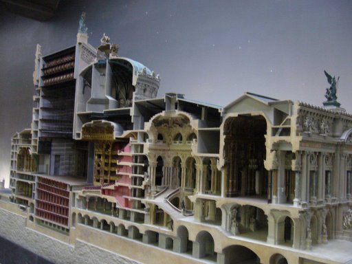
Cutaway model by Model by Richard Peduzzi, of the the Garnier's Paris Opéra. Via Oobject


To actually read what the different colors represent in various cultures, you’ll have to view the David McCandless original at his sight, Information is Beautiful. (By the way, his post today includes, and links to, one of the Du Bois charts from AME.)


Promotional infographic for the startup Airbnb, highlights some of the more unusual properties available for short-term rental. Via Co.Design


Snapped this one in San Clemente.


Map of touristiness, based on analysis of photos on Panoramio. Via LA Times


Twelve maps in a case showing the best bicycle routes in the state of Wisconsin. Published in 1897, by The League of American Wheelmen, the maps are keyed to show good, medium, bad, level, hilly, and very hilly roads. An Index map is provided as well. Via the David Rumsey Map Collection


This vintage map (year unknown), shows driving distances between cities in France.

Infographics Contest: Land a Jumbo Jet with Nigel Holmes


The folks at Lonely Planet are publishing ‘How to Land a Jumbo Jet,’ which they describe as a “visual guide to the world - a collection of cultural and travel-inspired infographics and visualisations of all kinds.”

And they want you to be in it. They are asking for submissions of ideas for visualizations from which they will commission content for the book.

Okay, there are plenty of infographics “contests” out there which are usually nothing more than clever, but thinly disguised attempts at getting free content from eager, creative, workaholics. But this is the real deal. The selected work will not end up on a web gallery, but printed on a full spread in a published book.

You will be paid for material to be published, and directed through the development and production of the graphic by infographics guru, Nigel Holmes. Getting paid to have Nigel work with you—I don’t think you can do any better than that.

Here's what they're looking for:
We want infographics that illuminate, entertain and inform. We want them to be great examples of information design, and we want the information in them to be true and for them to have a good degree of integrity. That doesn't mean they can't be light-hearted though!

They don't need to be about travel per se, they just need to provide an insight into the world from the perspective of a traveller. So it's not just a case of planes, trains & automobiles ... (Though it could be!)

How to submit an entry:
If you have an idea that you think would make a great infographic or visualisation for our book, read this section on submitting an idea, then simply email us with your submission.

Your idea doesn't haven't to be complete - sketches, mock-ups or even a written pitch for your concept are fine, just make sure you've read the project terms.

Start thinking!
Not sure what to create your graphic about?
-Visualise cultural faux pas for a particular country
-Show classic souvenirs from around the world
-Compare the popularity of chilli in a local cuisine with the happiness index of that culture.
-How about a world map featuring hotspots of tourism activity at Christmas time
Check out this infographic from David McCandless on reducing your odds of dying in a plane crash.


Stay tuned, my next post will be some visual inspiration for all info-jetsetters ...

Good Luck!

Black History Charts, 1900


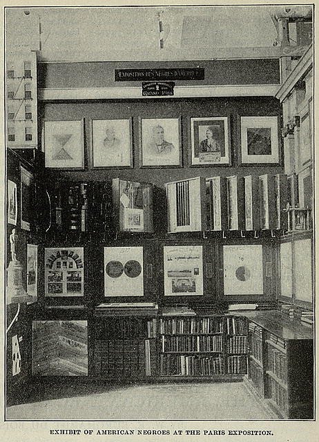
The stunning charts you see here were hand drawn and colored at the turn of the 19th century, by Sociology students at Atlanta University (now Clark Atlanta University). Their professor at the time, African American activist W.E.B. Du Bois, was organizing the upcoming “American Negro” exhibit for the 1900 Exposition Universelle in Paris.

Over 60 charts and maps, along with specially commissioned photographs were prepared for The Georgia Negro Exhibit, which was part of the larger display. Only three of these infographics are available in color from the Library of Congress. Click on them to view them larger. There are black and white reproductions of the entire group (see selection below), at the extensive online archive created by Professor Eugene F. Provenzo, Jr., of the University of Miami. There, you will find an enormous amount of information and visual material pertaining to this important historic exhibit.


The following excerpts from Professor Provenzo’s site offer more detail about the information graphics.
Du Boise described the project in his autobiography:
In 1900 came a significant occurrence which not until lately have I set in its proper place in my life. I had been for over nine years studying the American Negro problem. The result had been significant because of its unusual nature and not for its positive accomplishment. I wanted to set down its aim and method in some outstanding way which would bring my work to the notice of the thinking world. The great World's Fair at Paris was being planned and I thought I might put my findings into plans, charts and figures, so one might see what we were trying to accomplish. I got a couple of my best students and put a series of facts into charts: the size and growth of the Negro American group; its division by age and sex; its distribution, education and occupations; its books and periodicals. We made a most interesting set of drawings, limned on pasteboard cards about a yard square and mounted on a number of moveable standards.

From an official report provided to the Exposition:
Finally should be mentioned the results of the special studies carried out by Professor Du Bois. These consisted of a series of charts showing the condition of the colored race in the State of Georgia. This State was selected as being the one with the largest negro population. These charts showed first the general distribution of the negro race in all parts of the world, then the distribution in the United States by States, and finally the conditions in Georgia in great detail. These latter charts indicated the growth of the negro population in the State by decades; its relative increase in comparison with that of the white race; migration to and from the State; the distribution of the negroes according to age, sex, and conjugal condition; the occupations of the negroes; the number who could read and write; the value of the property owned by negroes; the number of acres owned by them or being cultivated by them as owners or tenants; the value of farm implements, horses, and stock owned, etc.

The variety and inventiveness of charting devices used, is quite impressive, especially for undergraduate Sociology students in 1900. Unfortunately, the quality of reproduction is not very good. I’ve uploaded the files here, as I found them. Some will enlarge when clicked, and some won’t. Once again, to view the entire series go here.


Fortune's Glorious Infographic Past


At long last, the article I wrote for Print based on my lecture about the amazing infographics Fortune published during the first half (1930-1970) of its 80-year existence.

A number of years ago, I was invited to give a presentation at Malofiej, the Society of News Design's worldwide infographics conference held each year in Pamplona, Spain. At the time, I was Fortune’s graphics editor and had always wanted an excuse to subject myself to going through every issue of the magazine and document its use of charts, diagrams, maps, etc. Talk about falling down the rabbit hole! Of the few hundred images I collected, some 80 went into the presentation, and 18 of those appear in this article.

I still like to imagine that I will do the book one of these days, but size is a real issue. Unlike the early spectacular Fortune covers that are legible even when reproduced as thumbnails (there weren’t even cover-lines in those days), the infographics are often readable only at the original print size. Each page was 11" by 14" in the early days, and many graphics ran as full spreads and with tiny labels. Sumptuous and gorgeous, but not very iPhone-friendly, or even iPad-friendly for that matter. I just can’t see an 8" by 10" format doing justice to the ‘Financial Irrigation of the United States’ (second spread, below), and I’m not sure I can handle being laughed out of the office of any publisher still in business. The research (in my best Cowardly Lion voice) is done ...


The body text should be readable when you click on the pages to enlarge.


Worldmapper: On the Grid


You may or may not be familiar with Worldmapper. It's a project that originated from the Social and Spatial Inequalities research group at the University of Sheffield, to create maps where geographic territories can be sized according to a whole assortment of other metrics, like population, literacy, income, etc. The resulting graphics are called cartograms and Worldmapper now offers almost 700 of them. Together they provide a fascinating visualization of global issues.

On a recent visit to the website, I discovered gridded cartograms. A uniform grid is imposed on a geographic territory and then each square is sized according to the value of a particular metric. This gridded mapping creates a way more nuanced representation than the traditional cartogram, which assigns a single value for each country. It also allows for analysis within one territory.

Here are some grid-mapped populations. A country like Italy, say, whose population is rather dense throughout, will look very much like its geographic shape, while Brazil (above), has quite a different story to tell.


What I Didn't Blog This Month


I sometimes find myself not blogging something visually interesting, cool, or even infographics-related, because absolutely every other visual blog has covered it.

Whereas print is a scarcity model of the finite page and limited shelf space (for which everyone competes), the Web is an abundance model. It’s a newsstand that is infinite, and you never run out of ink or paper. In fact, the only way anything gets noticed is by getting attention in lots of places—which in turn generates even more attention, in even more places. So repeated coverage is, in a sense, how the Web/blogosphere works.

My prehistoric brain, however, which was encoded during the “print era”, still turns away--either by habit or reflex--from blogging what everyone else has covered. After all, who needs me to show them what they have surely seen somewhere else.

But I know how we all “miss class” certain days. So for anyone who may have slept through the month of January, here are a few items I didn’t post.

Charting the Beatles
Michael Deal's exhaustive tracking of Beatles songwriting and recording. Very beautiful.


The 2009 Feltron Annual Report
An exhaustive tracking of the events in the life of Nicholas Feltron, by Nicholas Feltron, during 2009. Also very beautiful.
Reports from previous years


iPad ... and The Jokes
See more at Jezebel.