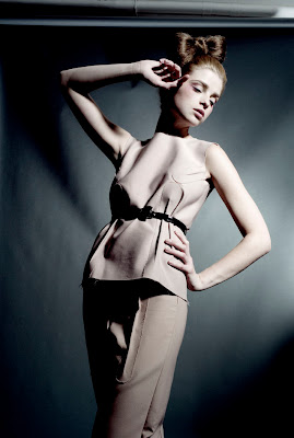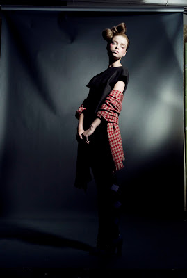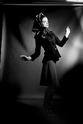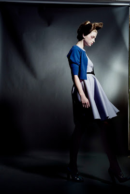


 I promised in my last post to tell you in the details of how you can recreate this lighting effect that I recently used in a studio shoot at Knuk in Florence, Italy.
 We wanted a dramatic lighting effect to create a little 'cinematic feel' in the studio.
Our steps ro create this look were as follows:
1. Background colour was Thunder Grey seamless paper and we hung the paper from a rod suspended from the ceiling. Instead of curving the paper where it meets the floor we made a fold and try to have a 90 degree fall from the wall to the floor. This helped to have less reflection where the curve would normally be.
2. We set a Fresnel light high to the right of the model that would give a 'cinema' type of light. We wanted a slightly 'blown out' feel on the model.
3. The background was lit with one light and numerous flags. The closer we moved the flags to the light the softer the shadows and lines became on the background. It was important to control the background whilst shooting (not too many harsh highlights) so that later in photoshop it wouldn't create big problems when we used curves etc.
4. On our final light tests we adjusted the main light on the model to be slightly brighter than the light landing on the background. We quickly downloaded a shot, tested the required effect of levels and curves in photoshop to see if we could manipulate everything without drastic problems.
5. For the post production I created a duplicate layer so if I needed to return to the original I could. I colour balanced the skin using a cmyk technique that you can see on a tutorial here. By the way this site has many wonderful photoshop tutorials.
Then I created a curve layer to brighten the model and darken the background. Once the model was lightened it was easier to adjust the colour balance on the background and on the foreground. I firstly adjusted the colour balance in the shadows for the background without drastically effecting the skin colour of the model. To perfect things I then worked on the colour balance in the highlights to adjust minor changes to the skin.
To finish the image and give it a de-saturated look I duplicated the image, made the duplicate into a good strong black and white, returned it to RGB and then created a layer onto my original image. I left the image in 'normal' on the menu and then reduced the opacity till I was happy with the results.
For the black and white I made the effect even more contrasty as I didn't have to worry about the colours becoming too saturated.
I hope you enjoy the info. Have a great weekend. Carla x